Appearance
Annotation Texture
It's possible to change the appearance of the little circle that represents an annotation. This is done with the setAnnotationsTexture method. An example of this can be seen in the Product Tour project. The annotations in that project are blue circles instead of the default black ones with a number in them.
Sketchfab has created a few examples to demonstrate this here. These examples look like hocus pocus to me, but they show two very interesting things. The annotation dots are taken from an image, but instead of using an image file they use a data URL or they generate an SVG on the fly. Both are quite useful, but let's start with an image file first.
js
api.setAnnotationsTexture(
  {
    url: "https://example.com/your-image.png",
    colNumber: 4,
    padding: 2,
    iconSize: 30,
  },
  function (err) {
    if (!err) {
      window.console.log("Updated annotation texture.");
    }
  },
);
You provide a URL to the image (which can be the URL to a file or a data URL). The colNumber is the number of columns in the image. The padding is the space between the icons. The iconSize is the size of the icons in the image.
Padding and colNumber and iconSize
You can use a single image for all annotations. For instance, a logo. You can also use a spritesheet. A spritesheet is a single image that contains multiple cells. The padding, colNumber and iconSize properties are used to determine the size of the individual cells in the spritesheet.

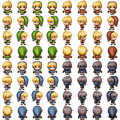
Spritesheet by smellykittylitter
This example is a spritesheet of 384 pixels wide and high. It has 64 cells in 8 columns. A single cell is 384 / 8 = 48 pixels. This means we should use the following settings:
js
{
  url: "https://example.com/your-spritesheet.png",
  colNumber: 8,
  padding: 1,
  iconSize: 47
}
TIP
When you don't have padding between your cells, use padding: 1, the iconSize should be 1 pixel smaller than the actual cell. Don't use padding: 0. There's a bug in Sketchfab that ignores a padding of 0 and messes up your alignment. 😅
The padding is assumed to be on the right and bottom of each cell in a spritesheet. This means that the first cell in the spritesheet should be at the top left of the image. When you use padding between the cells, the sum of the padding and the iconSize should be equal to one entire cell.
Default annotation issue
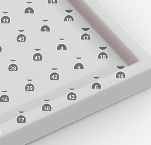
Let's start with an issue of the default annotations. If you create many annotations, the default annotation texture will misalign.

This example shows the creation of 256 annotations in a grid. Starting from the top left, you'll see the misalignment start at about annotation 50. And as you can see, the default annotations only go until 50. After that, the default texture is repeated. It's likely the padding in the texture is added to the top too. We can do better than this!
Image texture examples
Let's first use a single annotation texture. This is useful when you want to use a company logo as annotation for instance. The image is a simple PNG file.
You'll notice in the codepen that I'm using a Promise. We need to wait until all annotations have been created before the texture can be changed. The Promise will help with that.
WARNING
If you use a texture with and a texture without padding and you switch between them, the non-padded texture will be misaligned. This appears to be a bug in Sketchfab. Always use a value for padding.
Single image

js
{
  url: "https://assets.codepen.io/2407400/Klaas_profilePicture_128.png",
  colNumber: 1,
  padding: 1,
  iconSize: 127
}
This image is 128*128 pixels with 1 column. A single cell is 128 pixels. Due to the padding-bug, the iconSize should be 127 pixels and the padding should be 1 pixel.
Grid image

js
{
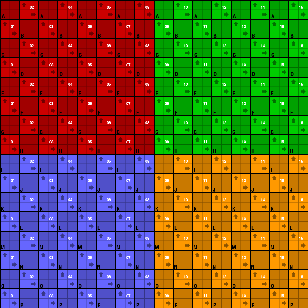
  url: "https://assets.codepen.io/2407400/uvgrid1024-colour.png",
  colNumber: 16,
  padding: 1,
  iconSize: 63
}
This image is 1024*1024 pixels with 16 columns. A single cell is 1024 / 16 = 64 pixels.
Grid image with padding

js
{
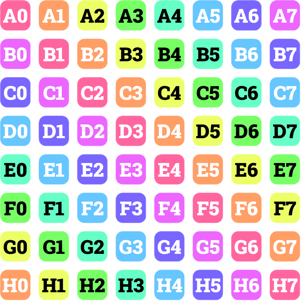
  url: "https://assets.codepen.io/2407400/annotations-grid-padded-3.png",
  colNumber: 8,
  padding: 26,
  iconSize: 102
}
This image is 1024*1024 pixels with 8 columns. A single cell is 1024 / 8 = 128 pixels. The images in each cell are 102 pixels. This leaves 26 pixels for padding.
SVG Texture
The advantage of an SVG texture is that we can create it on the fly and don't need to store the image. This is useful when you want to take user input and use that in the annotations.
In this example we create an an SVG texture when the user types in text. Each hotspot gets a single character of the text. Optionally, you can make the background of the hotspot white or a random color. The great thing here is that the SVG texture is created almost instantly. It responds really well to user input.